MENU
MENU

Nonprofit Website Design for kidsPACK of Lakeland

Case Study

kidsPACK has a simple mission – to feed kids. This local nonprofit that helps feed hungry children when school nutrition assistance programs can’t. Every week, staff and volunteers package hundreds of food items into discreet backpacks, which are then
distributed to children in need at their schools.

As a nonprofit, kidsPACK is dependent on the generosity of donors and volunteers to continue their essential work. Their website is often the first impression donors and volunteers have with the organization, so it’s critical that impression is a good one.

The Problem

The Process

Consultation

After kidsPACK reached out to {web Lakeland}, we had a 1 hour phone call to discuss their specific redesign requirements. kidsPACK had a good vision of what they wanted out of the project, so we were able to move quickly.

Design and Develop

We provided 3 mockups after 4-5 days of extensive competitive research. Once they picked their mockup and provided their slight revisions, we had the site fully developed for launch in under 3 weeks.

New website goes LIVE

The entire process was very hands-off for the kidsPACK team, although they were able to provide input at every step. This freed up their board of directors from tedious design meetings, allowing them to get back to their critical work helping kids.

Before After

The Results

Every page on the new kidsPACK website was designed completely from scratch. All custom graphics were used, with no templates and minimal stock graphics. The final redesign took over 320 man hours distributed across our team.

Before and After:
Nonprofit Website Redesign

We did a full nonprofit website redesign for kidsPACK, updating all of the copy in the process. Strong call-to-actions (CTAs) were added throughout the site, driving visitors to take action.

We also completely revamped the volunteer signup forms and donation page. The new donation page allows visitors to make a secure one-time or monthly donation in just a few clicks, helping to drive completed donations.

The new donation system adds a seamless integration for credit and debit cards, in addition to PayPal donations. We also created a new backend system for managing donors, giving kidsPACK the tools to further drive donations.
Before After
Before After

Volunteer Page

Before their redesign, the volunteer sign up form was an embedded form on the website. While basic information about volunteering was available, it was hard for volunteers to understand exactly what they were signing up for and was not sent to any particular list to manage.

Now, the volunteer page features options for all regular volunteer positions and special event volunteer shifts. Not only does this help volunteers feel like a part of the team from the beginning, but it’s dramatically reduced the back-end administrative time for processing volunteer applications.

A Fully Mobile Responsive
Nonprofit Web Design

The new kidsPACK is fully mobile-friendly, allowing them to recruit community support no matter which device their visitors use.

Over 30% of their website trac is from mobile – that’s a lot of supporters they might be driving away otherwise.

The Executive Director of kidsPACK
Reviews Web Lakeland

5/5

“When it comes to creating professional, attractive, and effective websites, there is no company that can surpass web Lakeland. Thanks to their talent, our site has taken off in the search engines like a rocket. In this day and age, it is impossible to get ahead as a business without the support of gurus like web Lakeland standing behind you. Thank You for bring our vision to feed hungry children alive to our community”

The Science

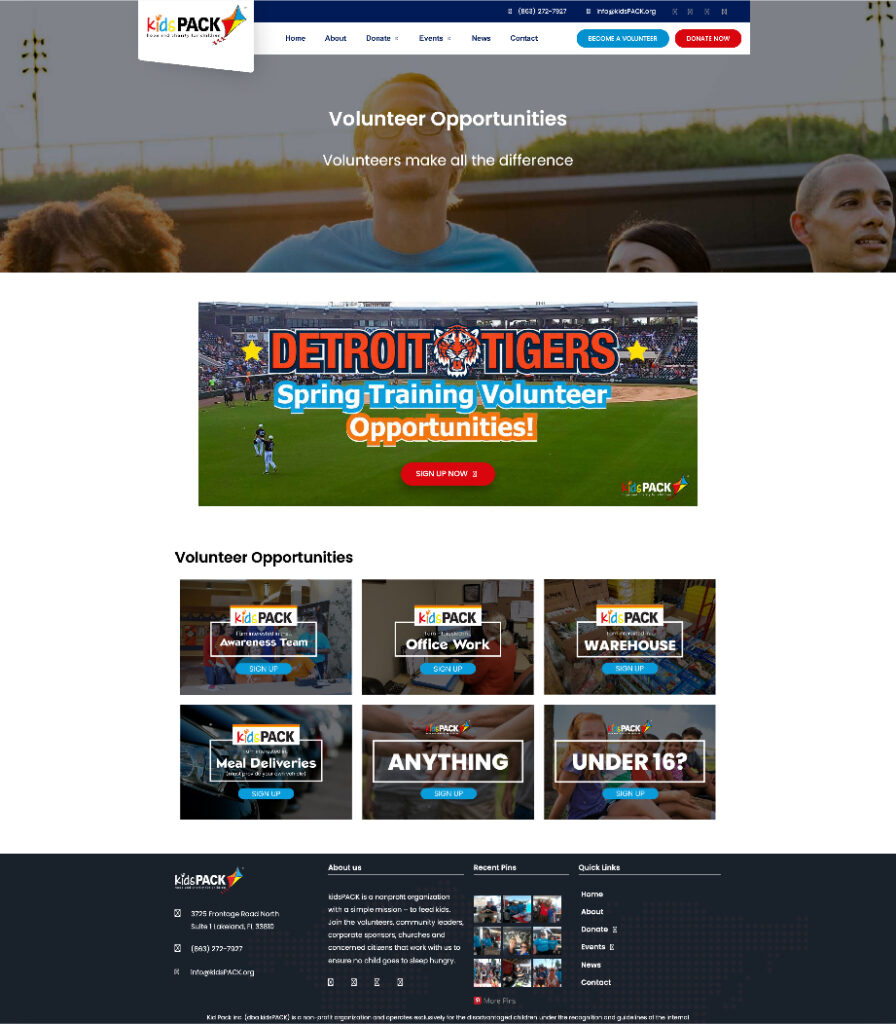
The overall navigation structure was also simplified, making the site easier to navigate. While the old design had Donate and Get Involved options in the primary menu, these were mixed in with
the rest of the options.

1 of 7

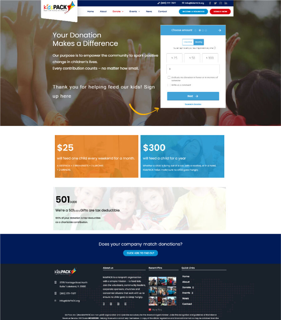
We also implemented a feature known as a “sticky menu”. The menu (along with the two primary call to actions) will be with the user the entire time they are on the site, no matter what they are looking at. Because the call to actions are always visible, they are more likely to be clicked.
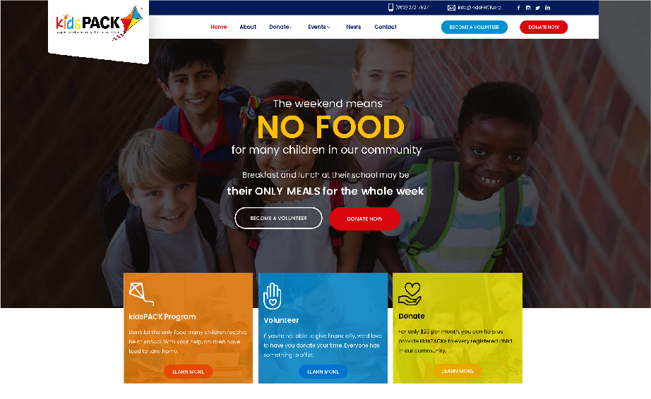
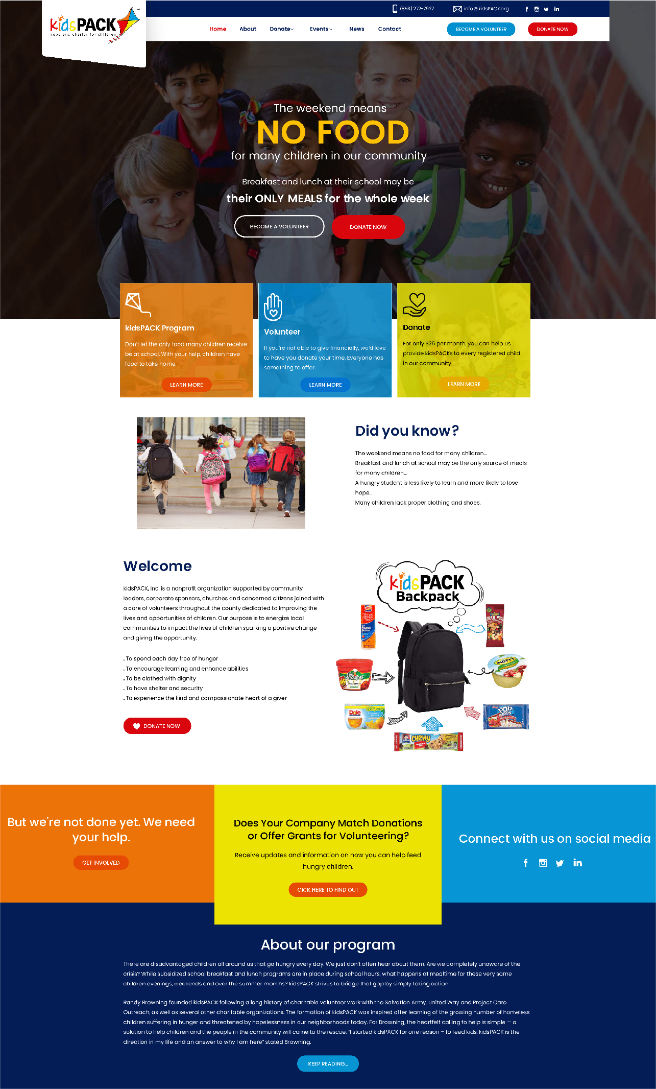
2 of 7

The kidsPACK website has two primary call to actions: Donate and Sign Up to
Volunteer. A button for each of these is prominently placed in upper right hand
corner of the navigation bar. This simple change directs attention to where it is most needed, encouraging action.

3 of 7

When it comes to nonprofits, a strong visual identity is critical. A memorable, trustworthy site can help your organization stick in the mind of site visitors, increasing the chances they’ll lend their support.
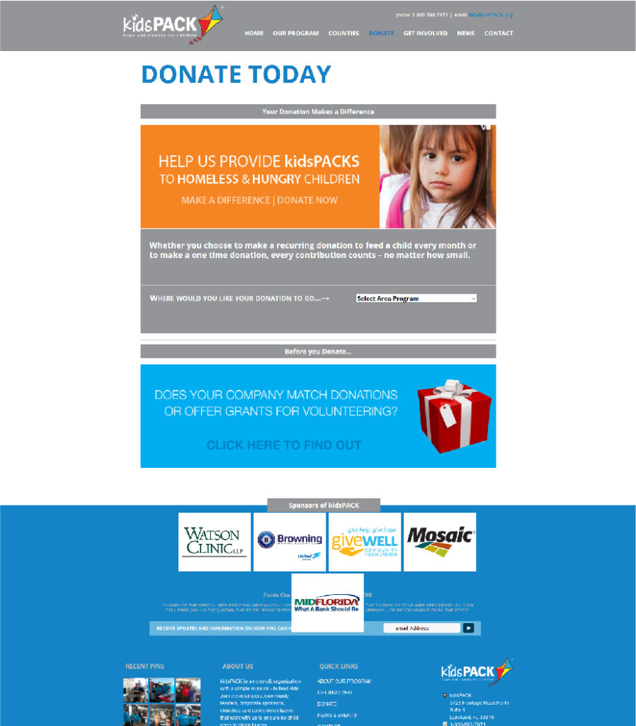
4 of 7

Throughout the redesigned website, the brand colors and identify are clear. The
color scheme matches the four colors used in the kidsPACK logo, without appearing “childish” or “cutesy”.

5 of 7

User experience (UX) design strategies helped us to create a website that was not only visually effective, but drove results.

6 of 7

User experience (UX) design strategies helped us to create a website that was not only visually effective, but drove results.

7 of 7

kidsPACK gets 5-15 phone calls per day about various opportunities. To better facilitate this, we enabled click to call throughout their site. Now, when someone taps the phone number on the website, it automatically opens the phone app and starts the call.

Because sticky menus and click to call are so successful on a variety of websites, we now include them by default in all {web Lakeland} redesign projects.

The redesign not only pulls out and highlights the target options, it also features Events more prominently. As kidsPACK is known for several large annual community events, this change helped cut down on an annual influx of confused visitors looking for event information.

Before Vs. After

Get Your Free Mockup Now

Eager to get started on your new lead-generating website? Let’s talk.

Your site redesign is on us.
Once your site launches, plans start at just $99/month.